Oh, I forgot to add that I didn’t normalize anything before going into fluid.umap~. So the MFCCs are in whatever weird range they are, the loudness is in dB and pitch is in MIDI.
So the data looks something like this (the rows are in random order):
rows: 1715 cols: 21
1     7.5122   -18.776   -12.415       ...  -0.27735     87.31   -53.293
10     1.5144   -18.605    -9.722       ...   0.38857    93.144   -56.418
100     1.0442   -10.104   -9.5277       ...   0.35186    77.097     -33.9
       ...
997     4.6128   0.61793    2.3301       ...   -1.5062     95.02    -47.25
998      5.323  -0.35285   -2.2085       ...  -0.36513    86.027   -42.957
999      3.578    -2.352   -2.4126       ...   -1.4234     83.26   -47.525
I will have some more detailed questions about the best way to approach this in another thread, as part of me building this was to make an IQR-based rescaler, so I wanted to be able to visualize what is happening throughout the process.
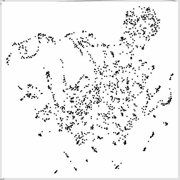
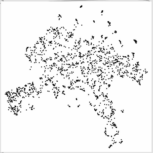
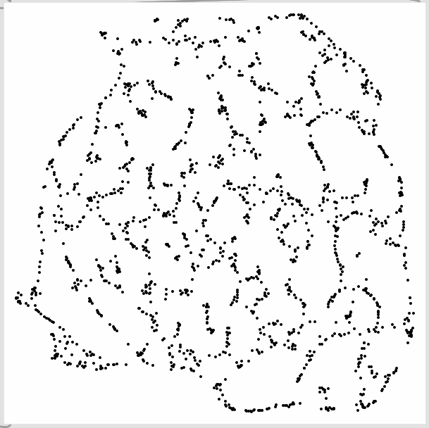
On that note, and out of curiosity I plotted some variations of this dataset.
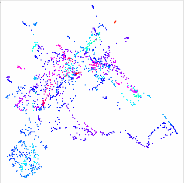
Here is the 21D space (20MFCCs (19), loudness, pitch) mapped via 3D umap (what’s displayed above essentially):
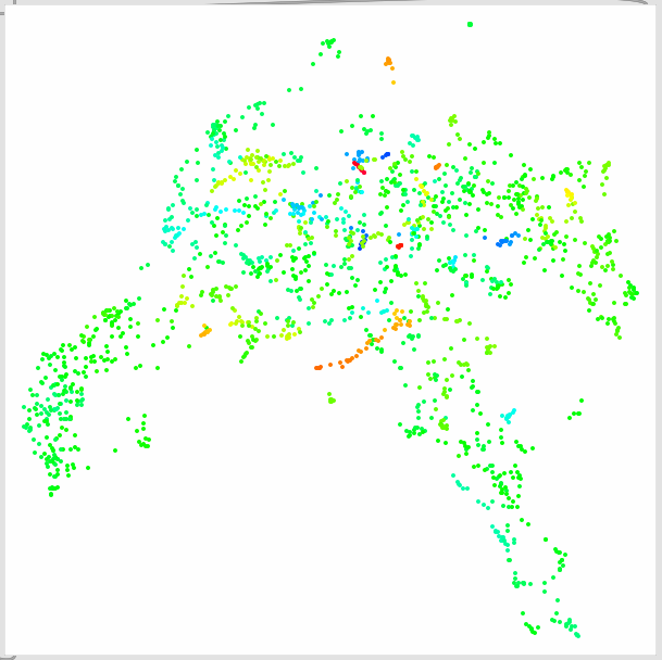
19D (20MFCCs (19)) to 3D:
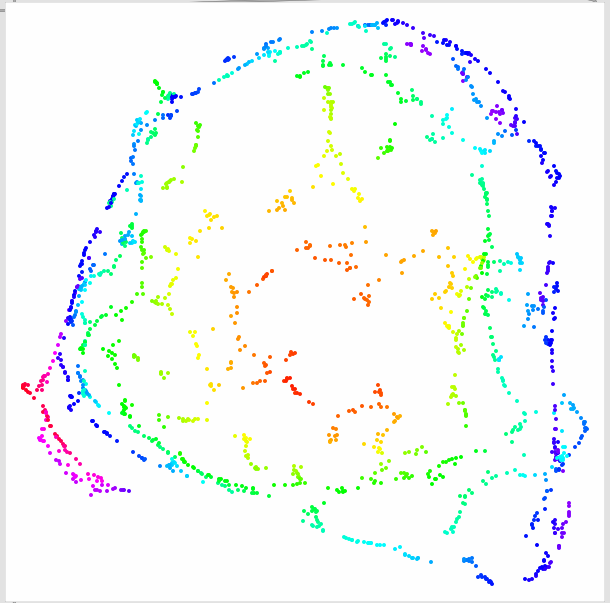
2D (loudness/pitch) to 3D (via UMAP):
Here’s 21D (20MFCCs (19), loudness, pitch) to 2D:
19D (20MFCCs (19)) to 2D:
2D (loudness/pitch) to 2D (via UMAP):
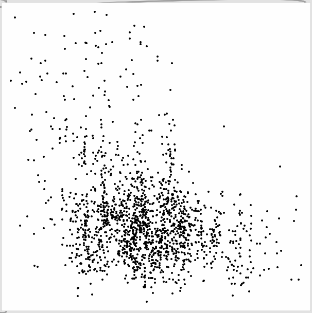
2D (loudness/pitch) mapped as raw (normalized) data: