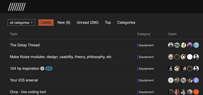
I like the fonts and colors, but it’s way too white…
Grey font on white background is brutal, particularly at night.
Make the fonts darker please, and adding a dark theme would be really nice too. I browse the lines forum this way and it’s way more enjoyable.
1 Like
thanks for this. I’m sure @groma will agree with you  I will also as soon as I read it in the evening… but you know, morning person and all, bright, shiny works for me
a dark theme is a good idea and I’ve forwarded to @weefuzzy who is liaising with our graphic designer.
edit: I’ve just activated the dark mode - it is not as custom as the other but it works for now
1 Like
Thanks, as ever, for the feedback @rodrigo.constanzo. I’ve had a poke around the theme stuff – there’s not much to it, but there’s also magic been done by Discourse itself insofar as it automatically derives some colours from a palette. Fortunately, we can mess with the palette without messing with the rest of the theme, so I’ve made the basic text colour darker for now, which will hopefully improve life.
The default Dark theme is still available, and we’ll look into a dark version of the custom one.
1 Like
I think the new font is worse for readability and the way it uses space, but I use the dark mode anyway as its got both things that I want. Just my 2c
One thing I’ve noticed is that if I’m in the dark theme, the copy code little widget isn’t there any more.
Is that something that needs to be manually enabled for each theme?
I think we’ll do a proper dark theme with the copy widget (which indeed has to be copied IIUC)
edit I’ve added the widget to the dark theme in the meantime just for you @rodrigo.constanzo
1 Like
I appreciate the change too 
1 Like

 I will also as soon as I read it in the evening… but you know, morning person and all, bright, shiny works for me