Funnily enough, exactly the same size burger as ours Nonetheless, given that I had such a menu in the works for the KE, good to know you aren’t a fan (although you may get it anyway).
It’s definitely commonly used, but then again, so is “the ribbon”. Doesn’t mean it looks good or navigates well. (it’s a lot of wasted space, and no actual indication of what the categories might be before clicking it)
Either way, this is not a subject worth navel gazing about.
it can be anything, I think larger and bigger font would be OK for a phone, but for a desktop I would expect it to use the kind of space used by the hamburger menu currently at your top right.
To be fair, the patches.zone webpage’s has a significantly smaller footprint in terms of what their hamburger does when it slides out and related font sizes.
 there are 3 top right buttons that are hidden for now and until we go public: download/learn/discuss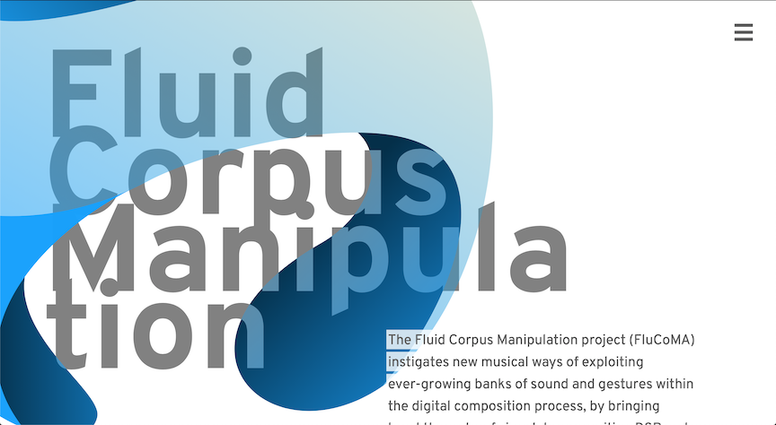
 It’s been designed by a designer. It’s not that large on all the pages